- Home
- Services
- Get a Quote
Our Contribution
Redesign subscription and payment services, Restructure website and checkout services, Shopify integration, UI/UX design.
We restructured and redesigned the services for Vibes Tribe, a wellness brand selling various products and positivity services. The services we provided included redesign subscription and payment services, restructure website and checkout services, shopify integration and UI/UX design.


Objective
A clear, concise and easy-to-navigate dashboard and effective implementation of services.
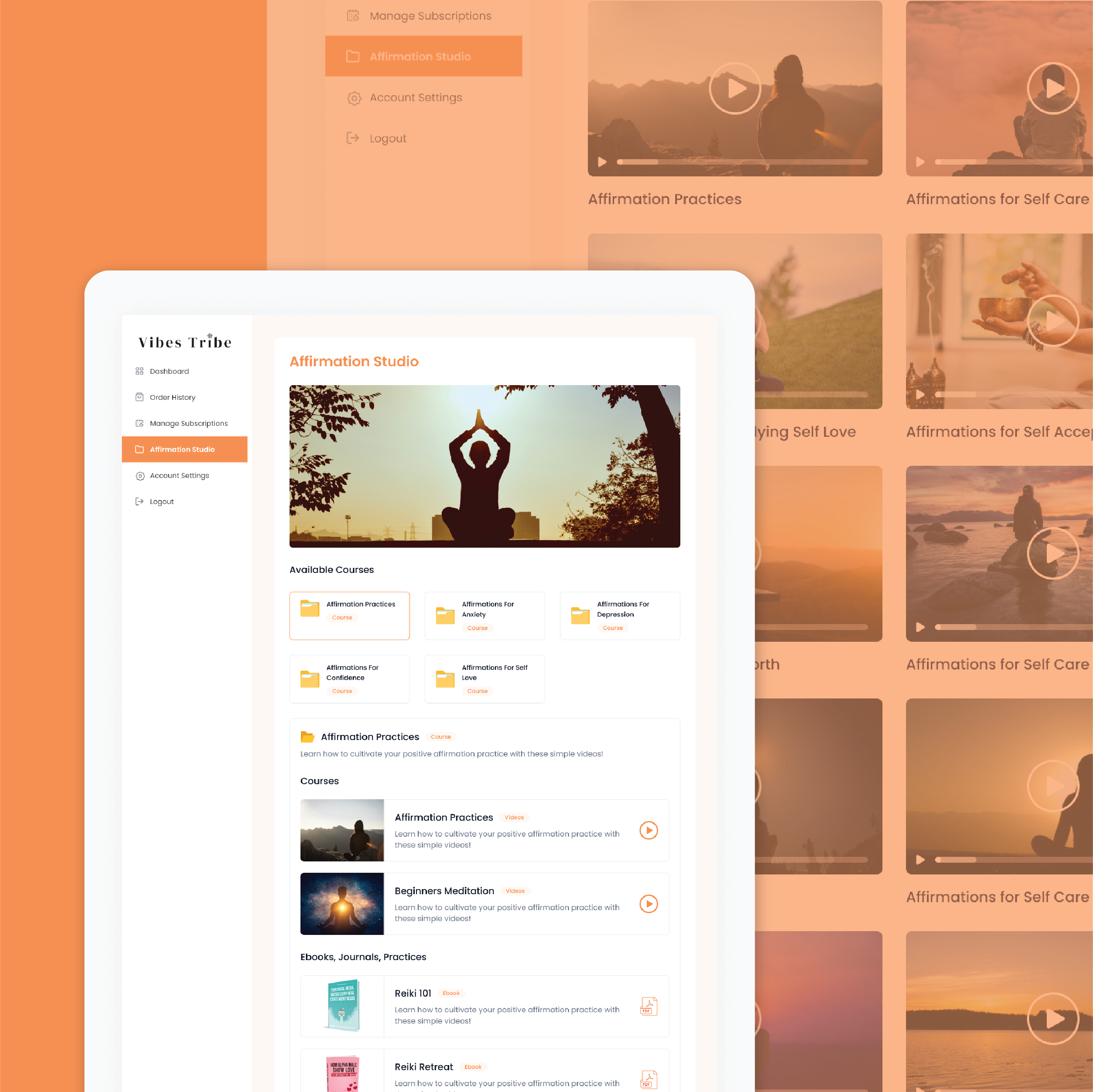
The objective of the project was to create a user–friendly and comprehensible dashboard for Vibes Tribe to showcase all their products. Along with that, we had to make their payment services workable and easy to interact with.


Problems
Lack of functionalities, Slow, Cluttered website.
One of the key issues that the initial website of Vibes Tribe had was that a lot of their services, such as subscription model, payment/cart, and checkout were non-functional, they didn’t work. They were built on a system which was non-appropriate for subscription services. And they did not have the technical capability to implement the services. On top of that the website was slow, sluggish and had a lot of elements in one page. It lacked a navigation sidebar, making it difficult for a user to browse through their site.
Challenges
Restructuring, Shifting the platform, Optimize website
Some of the key challenges were rooted to their features. We realized that we have to shift some of their pages to another platform to address this issue. Another challenge lay in the designs. The cluttering and hard-to-navigate nature was a matter of rigorous research for the User Interface and User Experience, along with telling the story of their brand.


Our Solution
New Dashboard, navigation sidebar, Shopify Integration
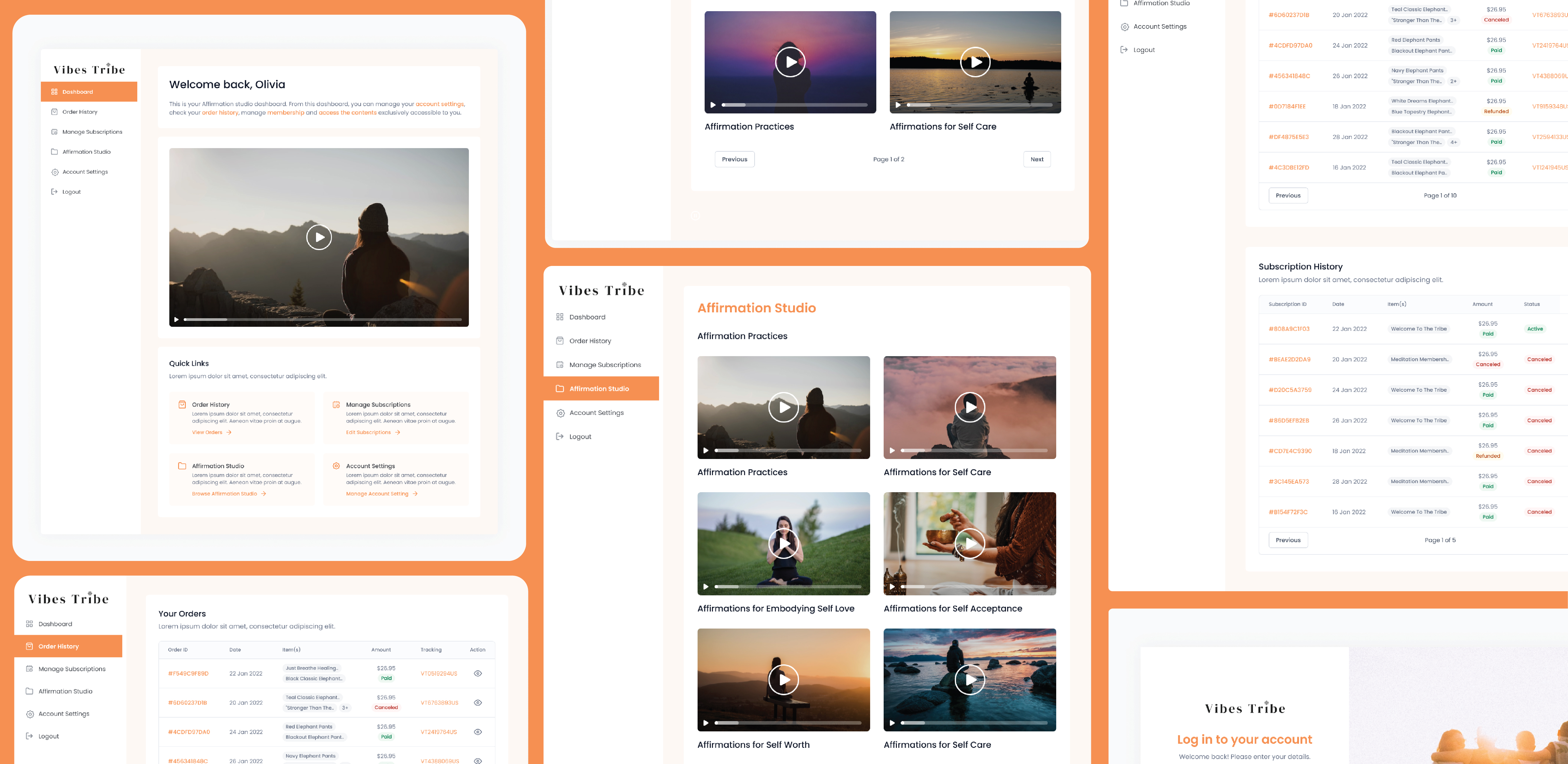
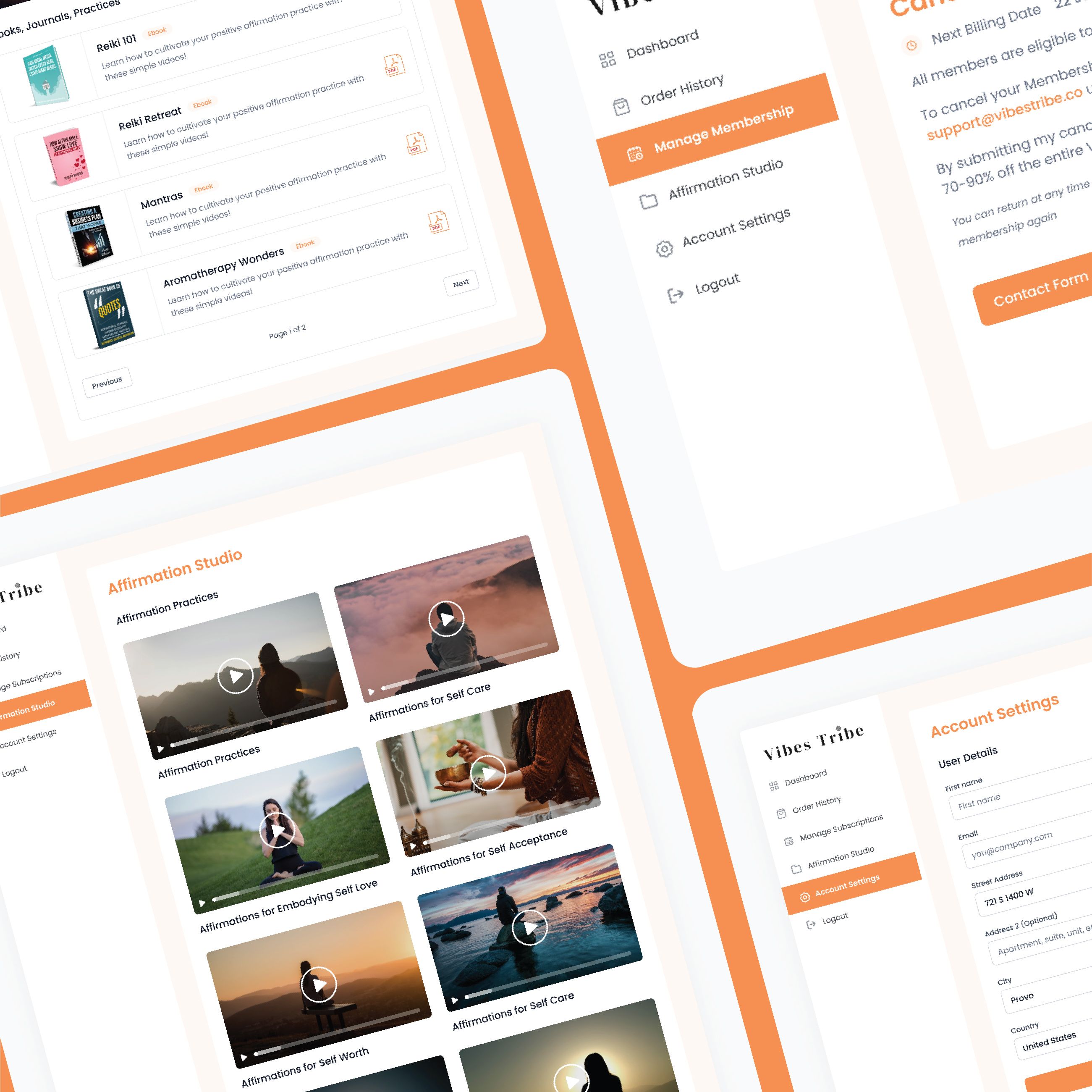
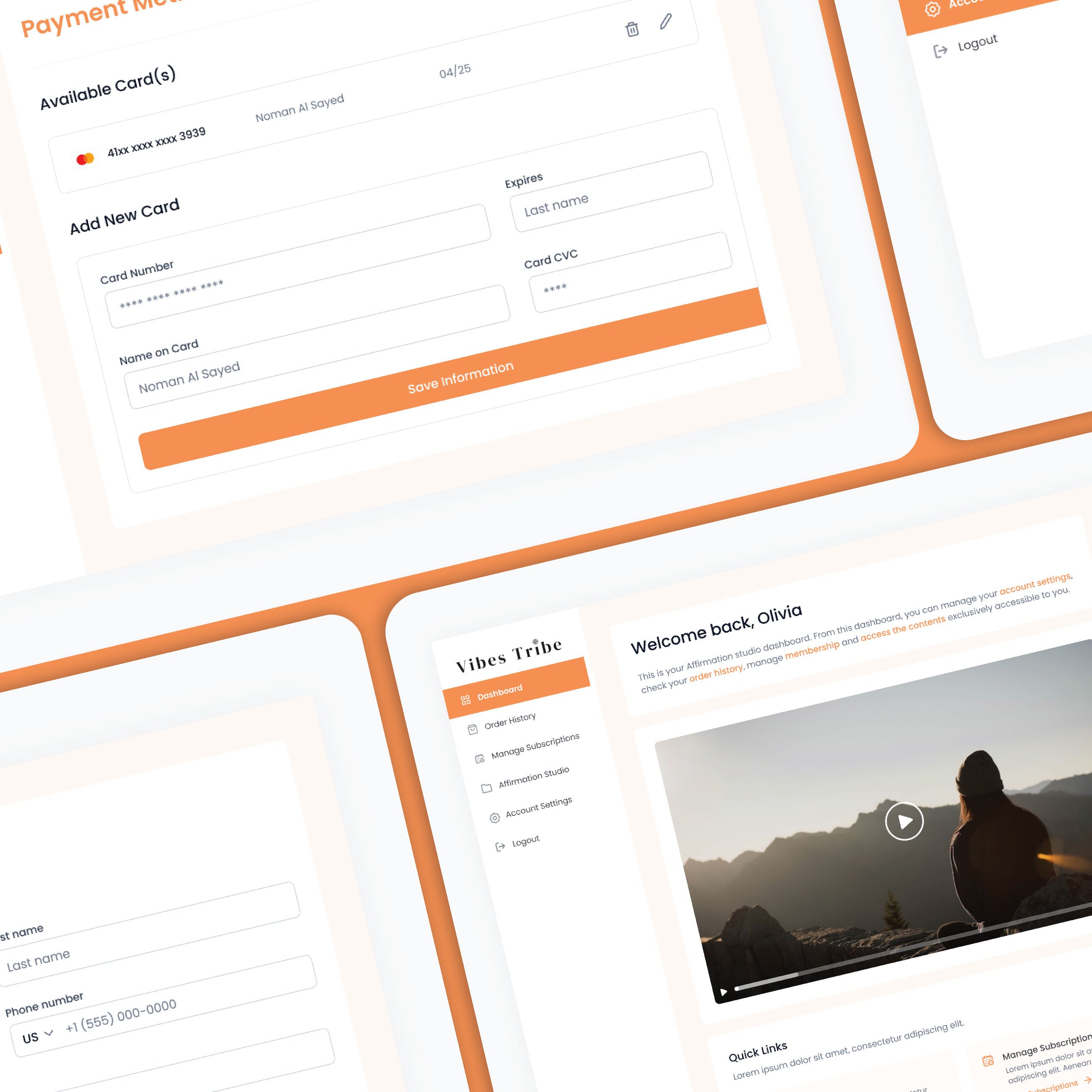
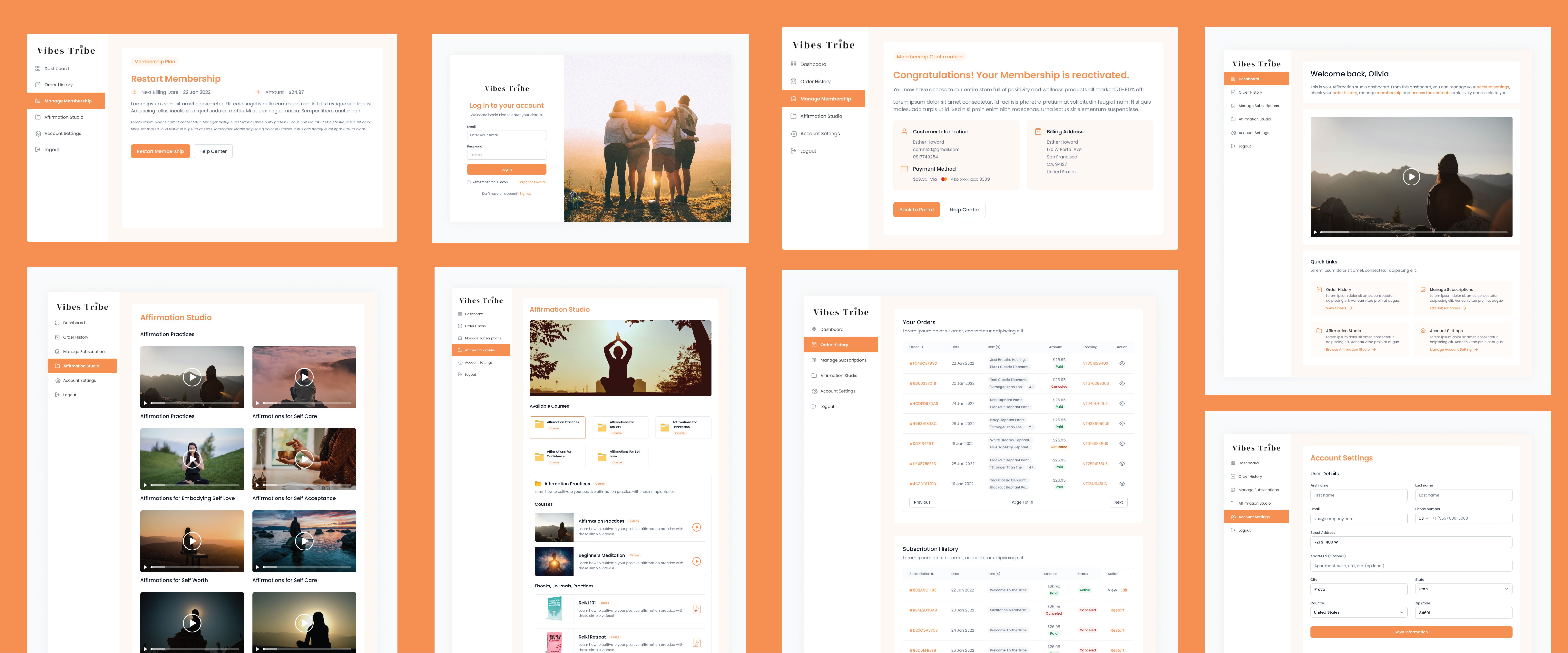
To address the issues, the first thing we did was rebuilt and redesigned the dashboard. We added a navigation sidebar, making it easier for the users to go to their desired services. The payment, checkout and subscription services required extra attention. We isolated the subscription services and shifted it to Shopify, as it was the better and one of the most convenient ways to handle the service.
Process
Organized and thorough workflow
At ThirdBit, we follow a structured process when working on a project. First, we began by sketching out different design concepts and layouts to determine the best approach for the website. Next, we create a wireframe to outline the structure and functionality of the website. This allows us to fine-tune the design and ensure that the website meets the client's requirements and objectives. Once the wireframe is approved, we proceed to the development phase where we integrate any necessary third-party apps, implement the designs and test the website for bugs and performance issues. Finally, we delivered the final product to the client, which in this case was a modern and visually appealing website for Vibes Tribe.
Sketching
Initial sketches
We began by sketching out different design concepts and layouts to determine the best approach for the website.


Wireframe
Structure and functionalities
Next, we created a wireframe to outline the structure and functionality of the website.


Style Guide
Focused on a expressive and positive visual
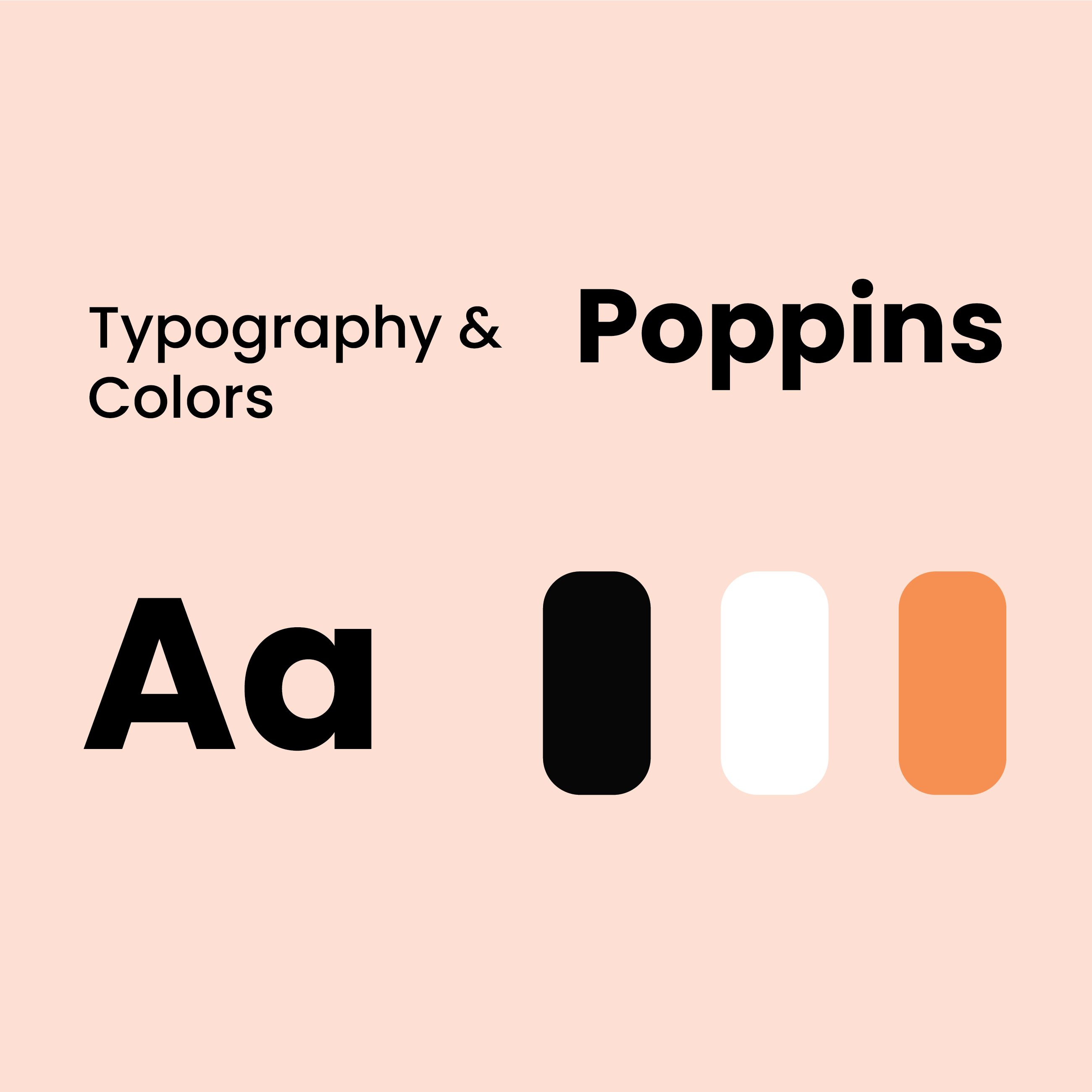
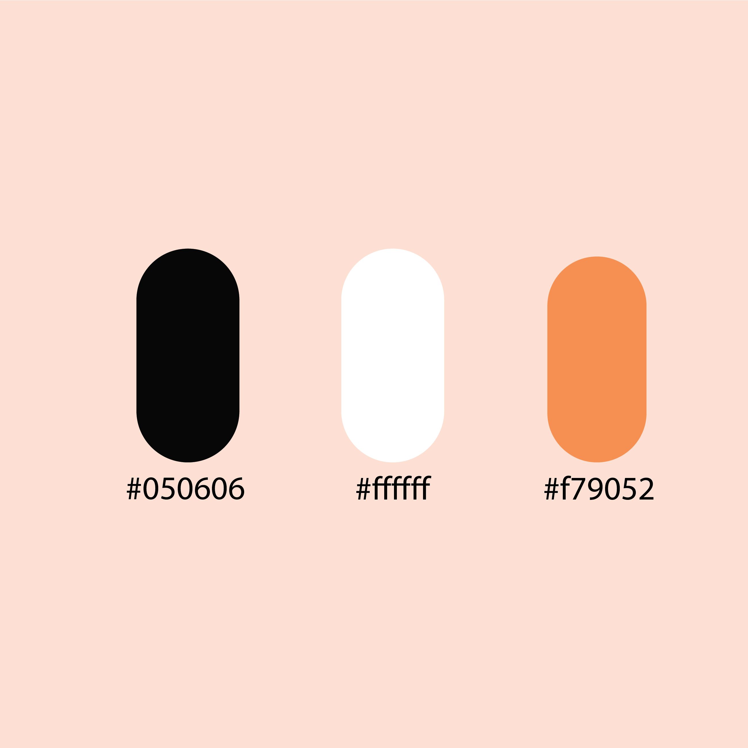
The style guide for Vibes Tribe’s website was designed to have an overall look that brings out positivity. This was achieved by using a clean and bright design, incorporating high-quality images of the products and using a color palette that is warm and approachable. The typography used on the website is also designed to be easy to read and friendly.
Final Product Output
A clean, positive-looking website with effective navigation and functionalities
The final product was a good-looking, bright website that boosted up the sales of vibes tribe by enabling the users to access more functionalities. Integrating shopify services for the subscription and payment process made it more convenient and easy to interact with. Our works made the website faster and significantly better for usability.
